Singapore Polytechnic
Background
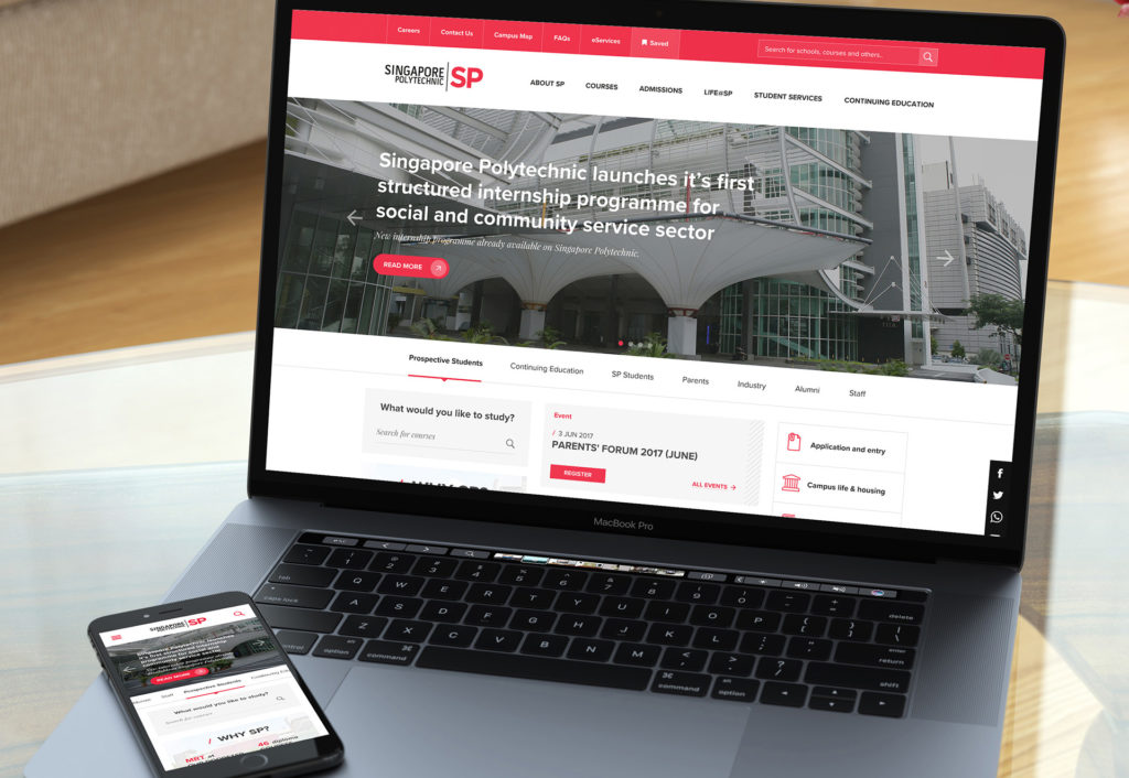
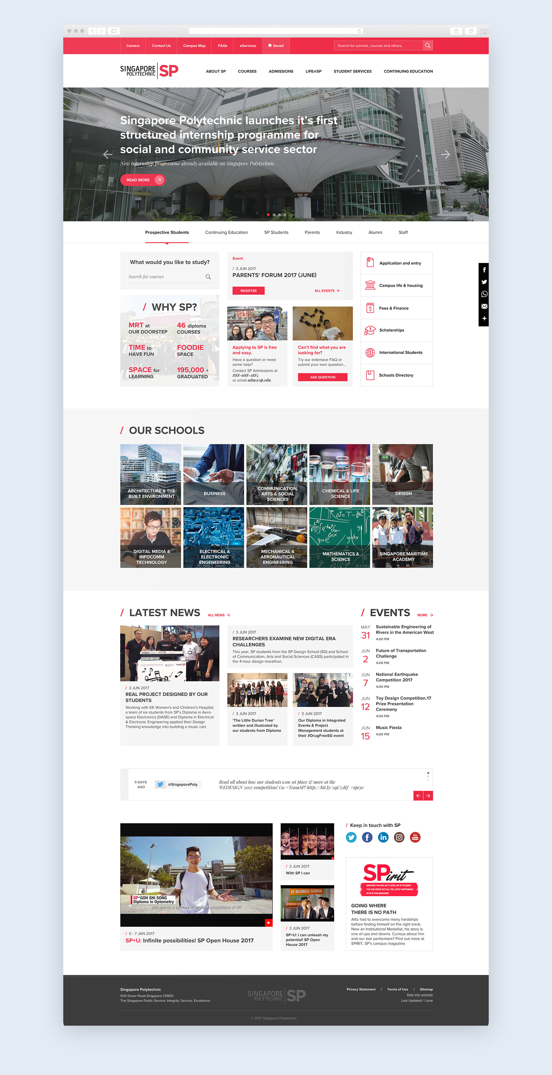
This design is a suggested concept for the Singapore Polytechnic I’ve done working in Adelphi Digital. The main challenge was to simplify navigation – 2 navigation menus (each one had 3 levels) on the old site. The solution for this concept – is an IA revamp to reduce the number of menu items and keep all the content easily accessible at the same time. Persona-based navigation at the homepage aims to make navigation intuitive, especially for new users, giving access to the most important information for each user group in 2 clicks. All the schools are also listed on the homepage to give some visual reference.

Suggested Homepage Design

Poly Schools
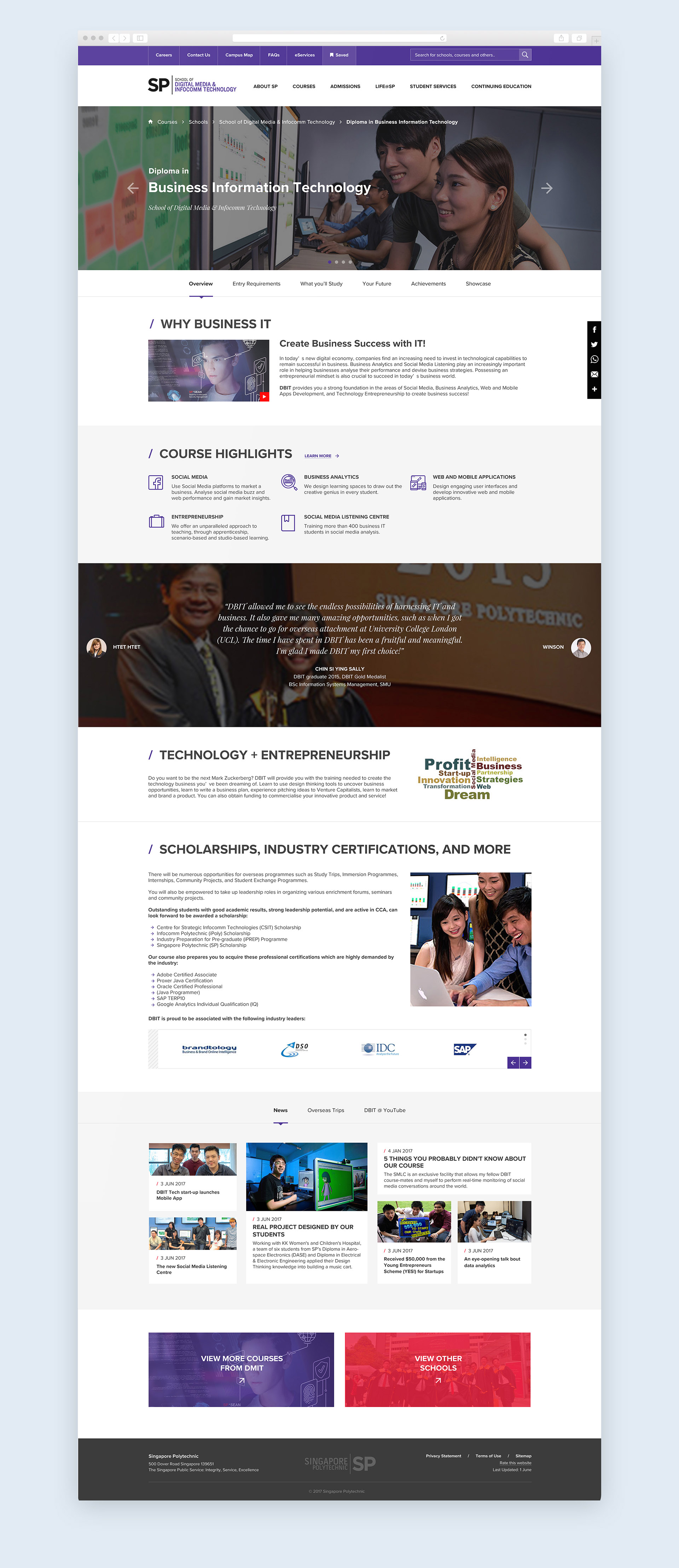
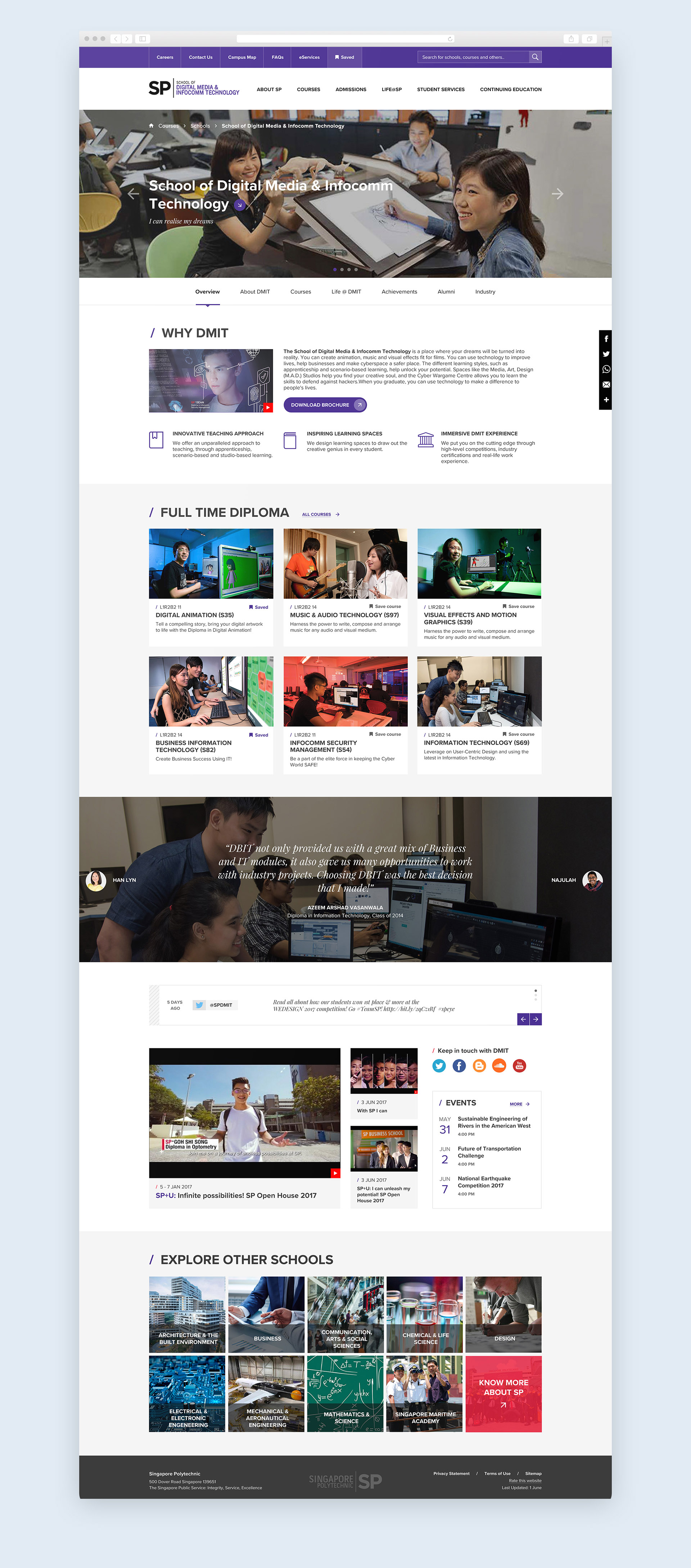
Singapore Polytechnic has 10 schools. Each one has its own microsite which follows the same visual style & navigation pattern as the main website. In this concept, the user experience is consistent and easy for each microsite. Introduces “Save course” feature allows the user to the same course which is interesting for him to quickly access it later, which might be very important for the prospective students.

