IMPixel
Background
The PIXEL is a Singapore government initiative under Info Communications Media Development Authority that allows tech start-ups and small teams to get access to the well-equipped physical lab, studio, incubation facilities, on-premise expertise, panel of advisors and programmes that are built around design, data, engineering, ICT, and Media.
The PIXEL programme also serves as a physical platform to bring together the innovation community to collaborate, build, and access key markets.
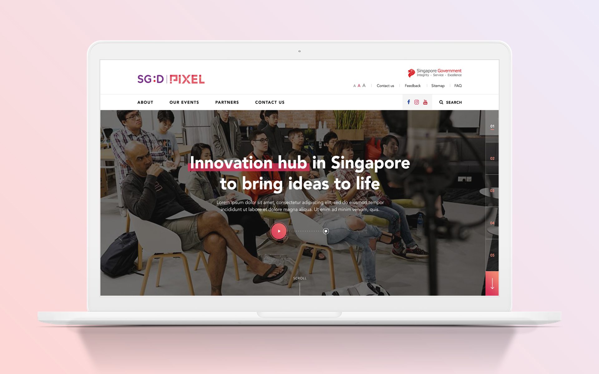
Objectives, competitors & audience
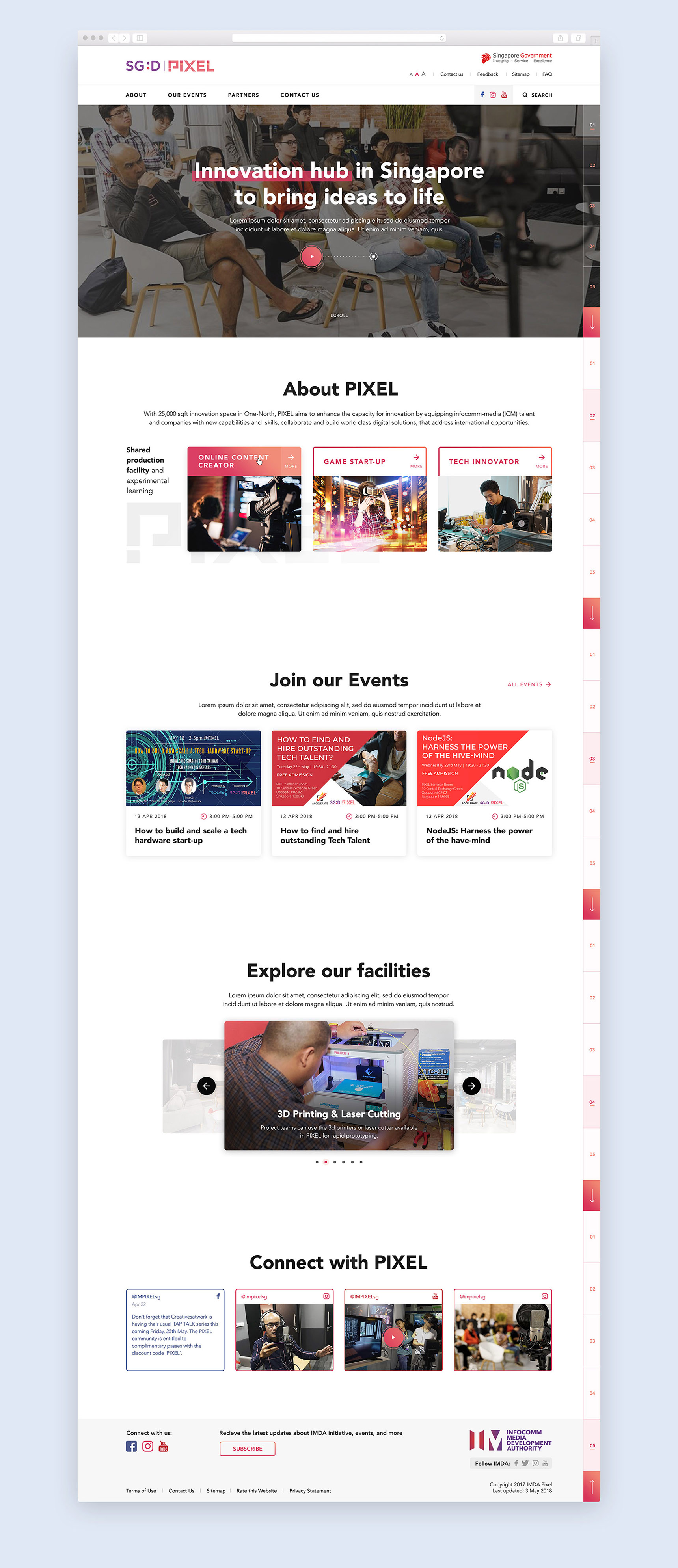
PIXEL has 3 main groups of target audiences: online content creators, game developers & tech innovators. Each group, they have a separate space in the building and provide different facilities. They also have workshops and events available to the public. We had design &
We were looking to create a new modern image of PIXEL, highlighting its relativeness to IT and making visitors aware of what PIXEL can do. We also aimed to create a website that will allow all the users to find what they need easily, not diving through a large amount of unnecessary information. The clean, minimal, and interactive design was our solution here.
I went through my design exploration, creating multiple variations of our design.
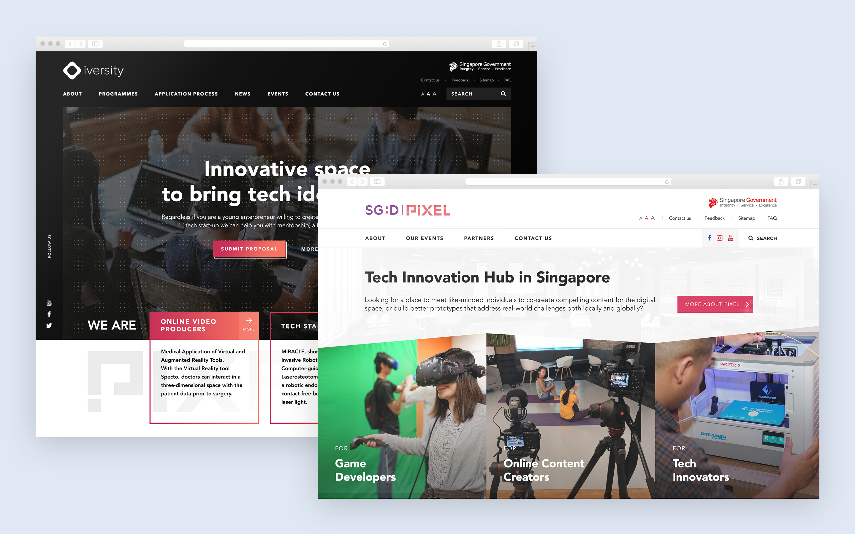
Initial Design Concepts
I came up with the 2 design concepts, featuring a bright and interactive design that aims to appeal to young and enthusiastic audiences. I was looking to have some nice front-end effects, such us cool hover animation on the homepage, playing video on scroll, and frame-by-frame screen navigation. At the same time, the design needs to comply
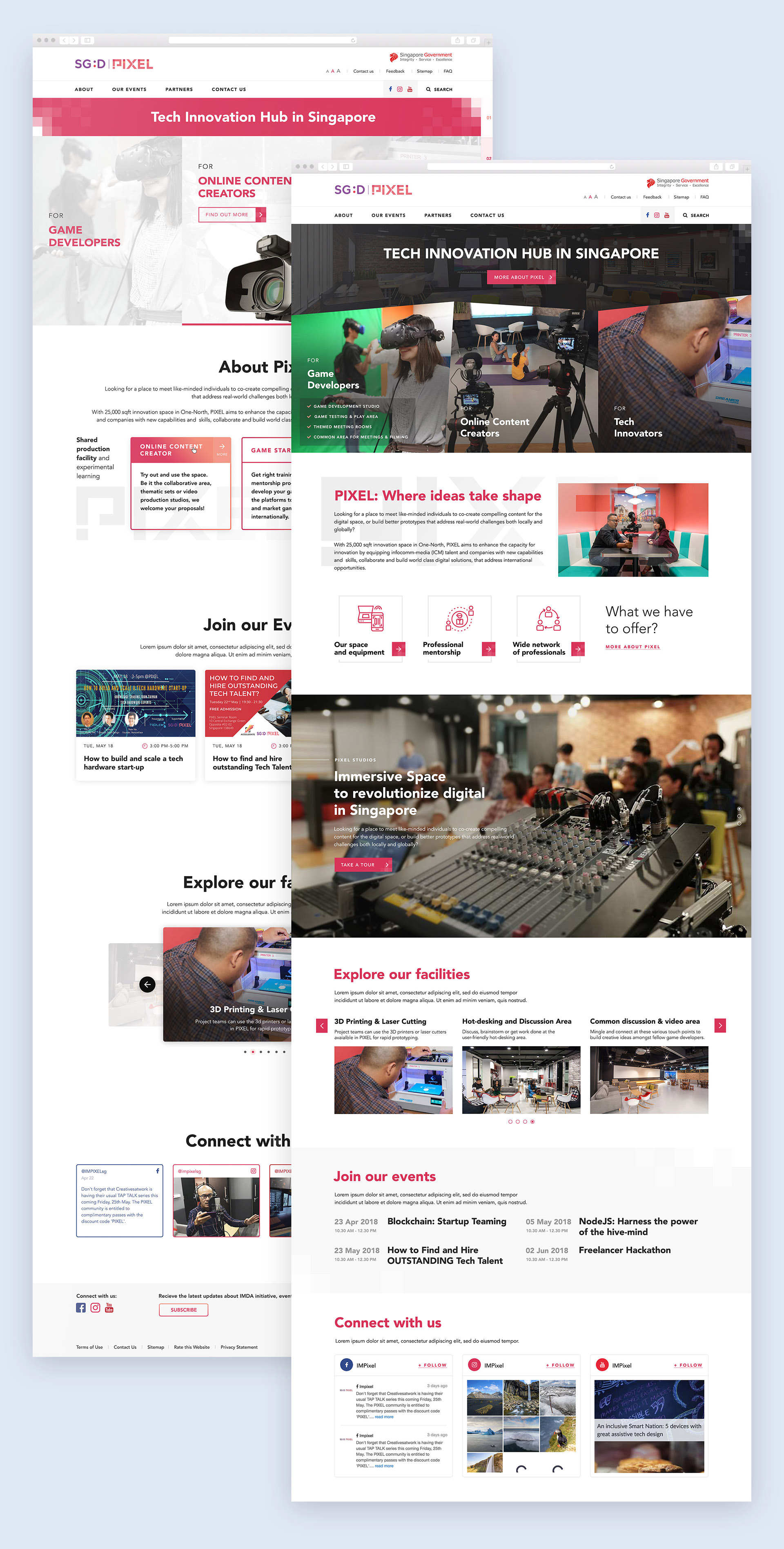
Baseline Grid
As a part of my design process, I use 8px baseline grid to ensure high quality of implementation and scalability of my design. A baseline grid is an underlying structure that helps guide the vertical spacing of the design. The baseline grid is a way to maintain consistency across the website.
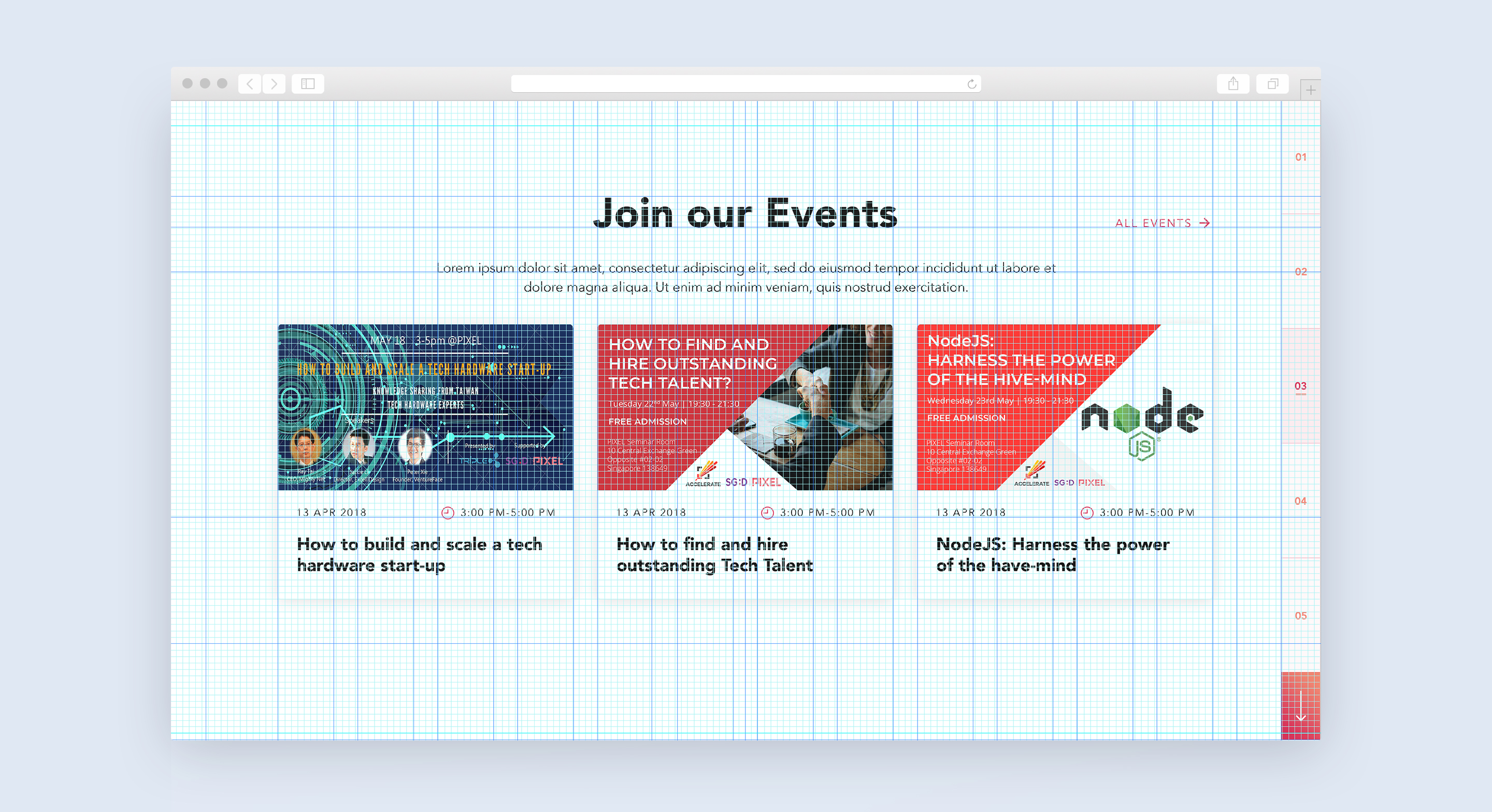
Final Design
After some iterations and
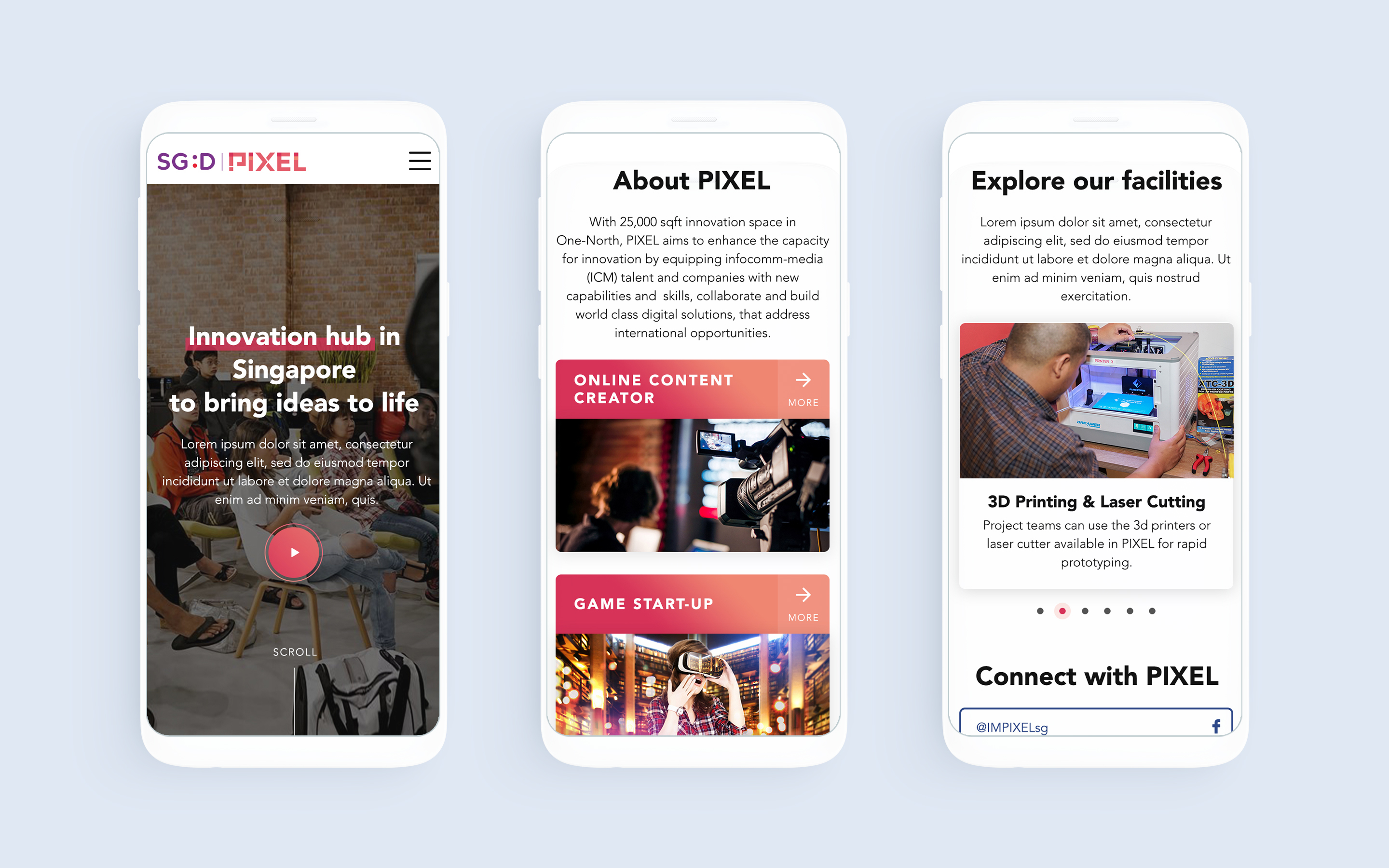
Mobile Design
The website is live now: https://www.imda.gov.sg/impixel